

 foi a inspiração para a Comic Sans 1")
Uma colisão frontal entre opostos: a excelência de Dave Gibbons com o pesadelo da Comic sans.
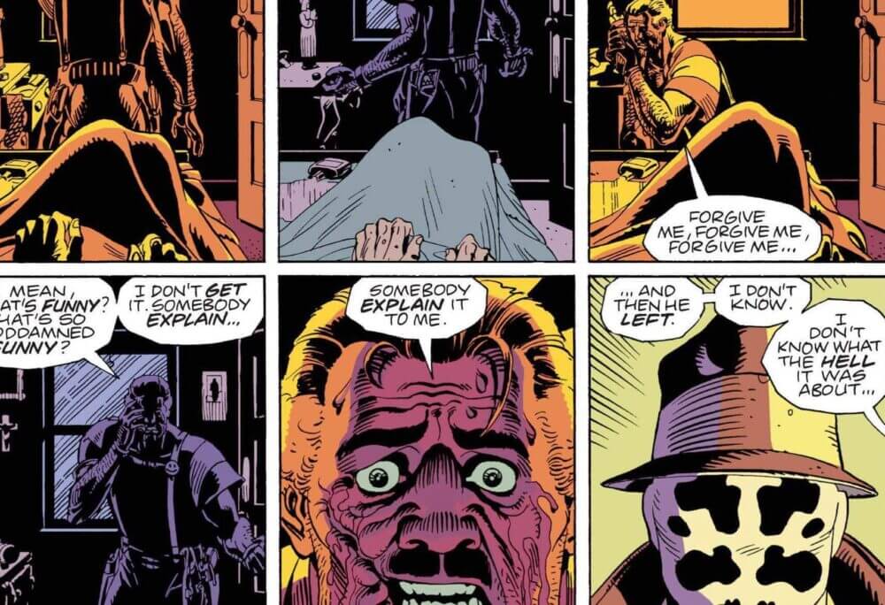
Dave Gibbons é um dos maiores desenhistas de histórias em quadrinhos de todos os tempos. Fez a série Watchmen, do Alan Moore, só para citar uma. Além da arte, Gibbons criou as letras dos diálogos, com uma fonte própria, chamada “Dave Gibbons Font”
 foi a inspiração para a Comic Sans 2")
 foi a inspiração para a Comic Sans 3")
Que por sua vez, inspirou uma outra, que acabou ficando mais famosa que a original, mas pelo motivo oposto. Estamos falando da Comic Sans, a fonte mais odiada de todo o planeta, criada por Vincent Connare para Microsoft (só podia), em uma única tarde de 1994.
 foi a inspiração para a Comic Sans 4")
Dave Gibbons deu uma entrevista uma vez para o site Creative Bloq contando sua opinão sobre a Comic Sans e dessa infeliz e inesperada inspiração para a fonte da Microsoft
Segue uma transcrição do audio para facilitar:
“I think the Comic Sans font is dreadful. The guy that did it has said that he knocked it off in an afternoon and you can’t design a decent font, even a kind of informal, hand-written one, in an afternoon. I certainly perfected my font over many years by looking at other letterers.
“Steve Parkhouse is a guy who pops up all over the place in comics and I literally learned how to do comic book lettering by looking over his shoulder and learned a few tips from him. I then looked at an American letterer called John Costanza and sort of took some things from his font as he had taken it from people before him. I mean, after all, there’s only so much you can do with an alphabet.
 foi a inspiração para a Comic Sans 5") I’d have much rather they’d just come to John or me and said: ‘Look can you do some hand lettering for us?’ I’m sure we would have done it really, really cheaply
I’d have much rather they’d just come to John or me and said: ‘Look can you do some hand lettering for us?’ I’m sure we would have done it really, really cheaply
Dave Gibbons
“He actually was also one of the sources of Comic Sans. The guy whose name I forget [Vincent Connare] who was working at Microsoft has said that he had to come up with an informal sort of hand-lettered font and on his bookshelf he had Watchmen and he had the Dark Knight returns by Frank Millar, which was lettered by John Costanza, and he sort of copied letter forms from them.
“I think what he came up with was vastly inferior, certainly to John Costanza’s lettering and I think also to mine. And I’d have much rather they’d just come to John or me and said: “‘Look, can you do some hand lettering for us?’ I’m sure we would have done it really, really cheaply and I’m sure that what’s out there would look a lot cleaner and a lot better.
“And you can get so many much better fonts than Comic Sans, I guess it’s just that it came bundled with every PC that meant that it was the choice when you wanted to do something a little bit jokey or hand-done. But oh, it is an awful font.
So the whole thing always looks wrong to me. I think it’s a blight, an absolute blight on modern culture
“What really bugs me is the letter ‘I’ in it because in comic books you only use the capital letter ‘I’, which is the one with the crossbars on it, for the first person pronoun. You never use it as a capitalisation of a word or within a word but I believe in Comic Sans that is the only letter ‘I’ that is available. So the whole thing always looks wrong to me. I think it’s a blight, an absolute blight on modern culture.”