

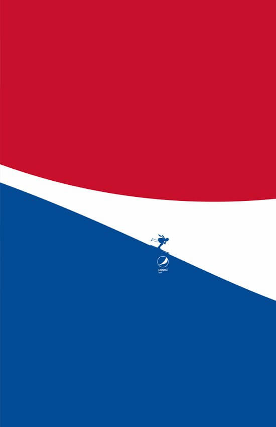
A agência Sancho BBDO, da Colômbia, criou outdoors em que as curvas do logo da Pepsi são ondas, gelo, neve, rios, montanhas, céu e paraquedas. A intenção é clara e poderosa. Simples e objetiva. Com contexto e muito bonita. O conceito do light – refrigerante com zero de açúcar e zero calorias – sempre foi ligado a aparência e às curvas do corpo. Desta vez – usando as curvas do logo como movimento, a ideia é usá-las como atividades. Convidar as pessoas a se mexer.

“Throughout its history Pepsi Light has highlighted curves; those linear figures that, at least conceptually, established the light spirit of the drink: thin, curvy women who freshened themselves with zero sugar and zero calories. We turned the logo curves into a sports activity that invites people to feel light, where the curves that we have seen and strengthened for more than 125 years, go from the aesthetic to something really meaningful.” – Daniel Álvarez, ECD to Pepsi at Sancho BBDO.


CLIENT
BRAND: Pepsi Light
CREATIVE AGENCY
CREATIVE AGENCY: Sancho BBDO, Bogotá
COPYWRITER: Fabián López ‘Chompi’, Camilo Torres Ángel, Kyara Ortega
ART DIRECTOR: Juan David Pardo, Tatiana Serpa, Sebastián Hernández
EXECUTIVE CREATIVE DIRECTOR: Daniél Álvarez
CHIEF CREATIVE OFFICER: Hugo Corredor, Giovanni Martínez
ILLUSTRATOR: Juan David Pardo, Tatiana Serpa
ACCOUNT DIRECTOR: Rodrigo Salazar
RETOUCH: Tatiana Serpa
GENERAL ACCOUNT DIRECTOR: Javier Jiménez
ACCOUNT MANAGER: Juliana Ordoñez
ACCOUNT DIRECTOR: Rodrigo Salazar